


Clüch / Branding /2024
[РУ]
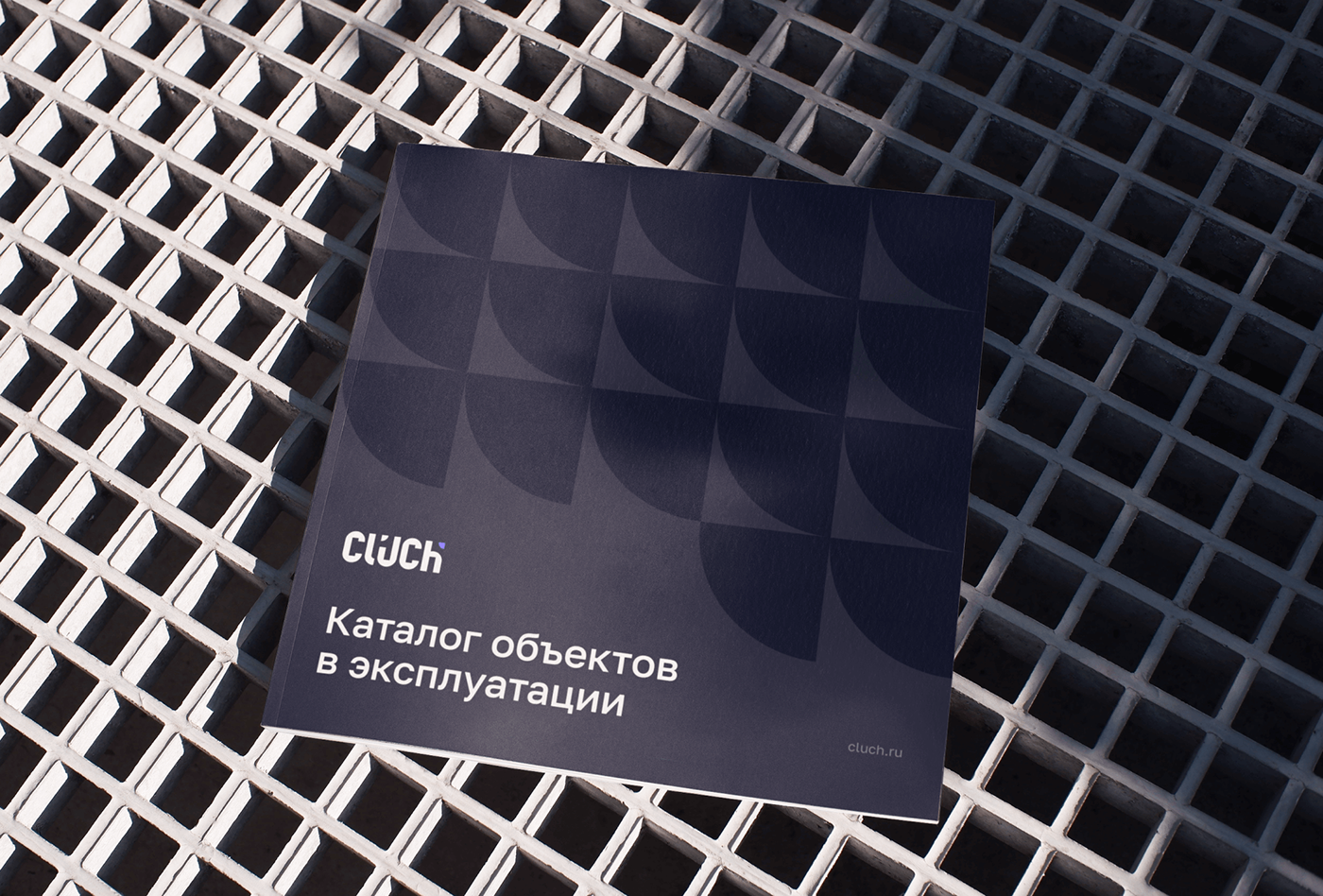
Clüch — облачный сервис автоматизации эксплуатации на объектах любого масштаба. Компания — разработчики и эксперты с 15-летним опытом в сфере технически сложного обслуживания недвижимости.
За два месяца мы разработали комплексную айдентику: подобрали название — ключ, характерное сфере фасилити менеджмента и легкопроизносимое для русскоговорящей аудитории, создали логотип, адаптируемый под зонтичность бренда, а также сформулировали основные правила фирменного стиля и упаковали их в подробный гайдбук.
[EN]
Clüch is a cloud service for automation of operations at facilities of any scale. The company consists of developers and experts with 15 years of experience in the field of technically complex real estate maintenance.
In just two months, we developed a comprehensive brand identity: we chose the name Cluch (Key), which is characteristic of the facility management industry and easy to pronounce for Russian-speaking audiences, created a logo adaptable to brand consistency, formulated the basic rules of the corporate style, and compiled them into a detailed brand guide.
In just two months, we developed a comprehensive brand identity: we chose the name Cluch (Key), which is characteristic of the facility management industry and easy to pronounce for Russian-speaking audiences, created a logo adaptable to brand consistency, formulated the basic rules of the corporate style, and compiled them into a detailed brand guide.
Russia


Logotype
[РУ]
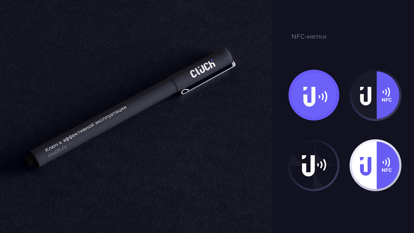
В основе логотипа — комбинация отрисованных букв и фирменного знака (квадранта круга).
Прямые и четкие внутренние углы букв отражают технологичность компании, инженерную точность и надежность, а внешние округлые формы придают дружелюбный и современный характер.
Прямые и четкие внутренние углы букв отражают технологичность компании, инженерную точность и надежность, а внешние округлые формы придают дружелюбный и современный характер.
[EN]
At the core of the logo is a combination of drawn letters and a corporate symbol (a quadrant of a circle).
The straight and sharp internal angles of the letters reflect the company's technological nature, engineering precision, and reliability, while the external rounded forms give it a friendly and modern character.
The straight and sharp internal angles of the letters reflect the company's technological nature, engineering precision, and reliability, while the external rounded forms give it a friendly and modern character.


Identity
[РУ]
Квадрант — в архитектуре, элемент зданий или конструкций, выполненный в форме дуги в 90°. Четверть круга — ключевой фирменный элемент. Значение элемента: целеустремленность. Знак напоминает стрелку, может заменять в макетах буллеты и образует целостность композиции.
[EN]
The quadrant is an architectural element of buildings or structures, made in the form of a 90° arc. A quarter circle is a key signature element. The meaning of the element is determination. The symbol resembles an arrow, can replace bullets in layouts, and forms the integrity of the composition.


РАЗРАБОТАНО КОМАНДОЙ
РАЗРАБОТАНО КОМАНДОЙ

Art Director: Nastya Strakhova
Designer Lead: Anastasiya Kilundina
Naming: Николай Махарадзе
Спасибо за просмотр! Пожалуйста, оцените наш проект
Thank you for watching! Please, like our project


